0-1 Product • Mobile App • UX + Product Design
Reducing Barriers to Women’s Participation in Pick-up Sports

Project Overview
Details
Role: Lead UX & Product Designer
Project Type: Self-Initiated, Pre-MVP
Team: Solo with mentors & consulting developers
Tools: Figma, Miro, Fig Jam
Timeline: Jun 2024 - Jan 2025
Introduction
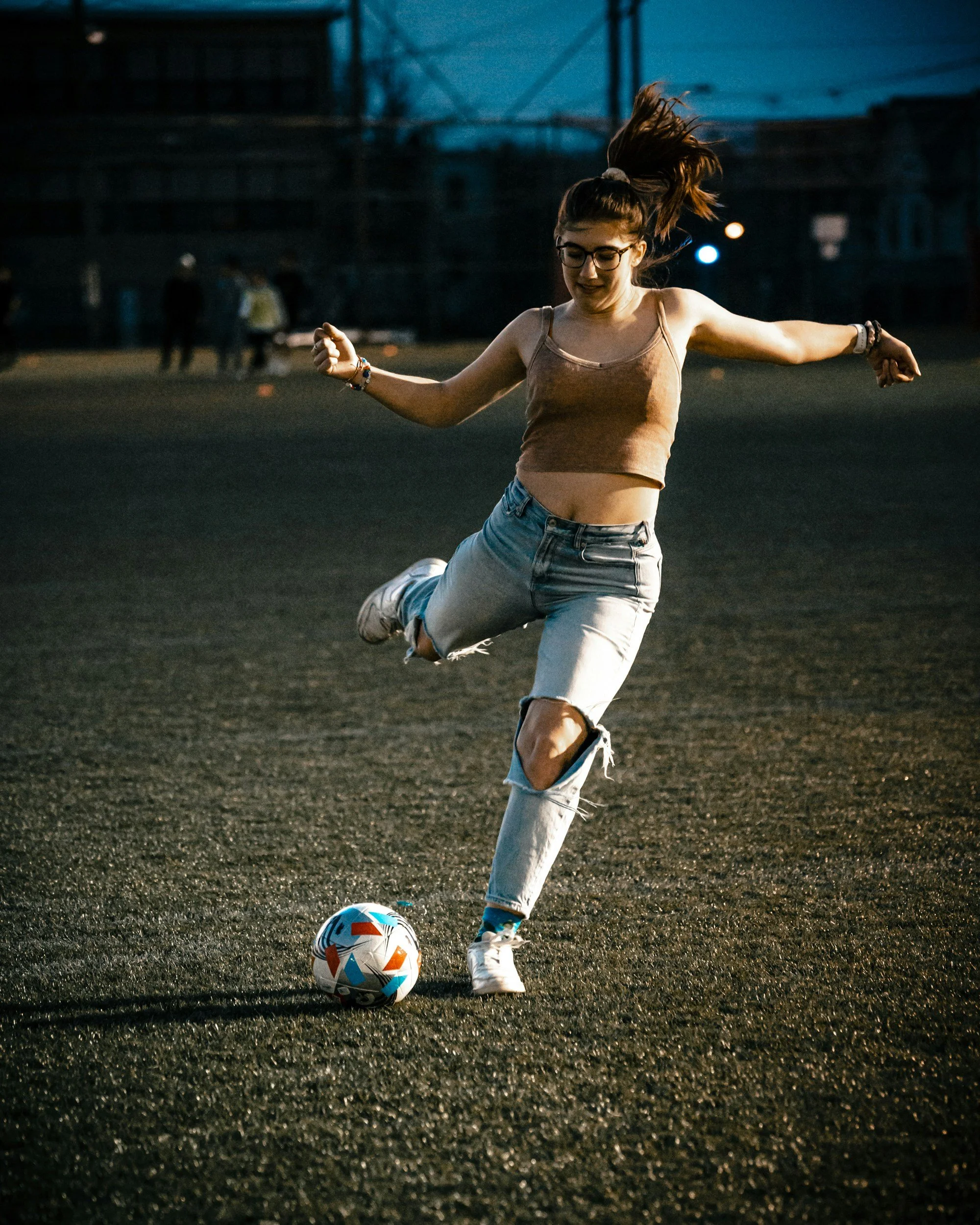
HerGame was born from a common frustration for women in recreational sports: wanting to play, but not knowing where to go—or not feeling safe or welcome when showing up. This app concept connects women to casual, local pick-up games while providing tools to host events and build trusted player communities with each other.
Responsibilities:
I led the full design process, from research and flows to prototyping and user testing. The result was a high-fidelity prototype that addressed key usability concerns and validated strong demand for user-friendly systems that facilitate women-centered sports spaces.
PROBLEM TO SOLVE
Many women who want to play sports struggle to find welcoming, consistent, and safe opportunities to participate in casual games — not due to lack of interest, but because of social and structural barriers.
Key obstacles uncovered through research:
1. Most casual games are male-dominated and often unwelcoming
2. Lack of organized, affordable options designed for women
3. Hard for women to find each other and gauge skill and interest
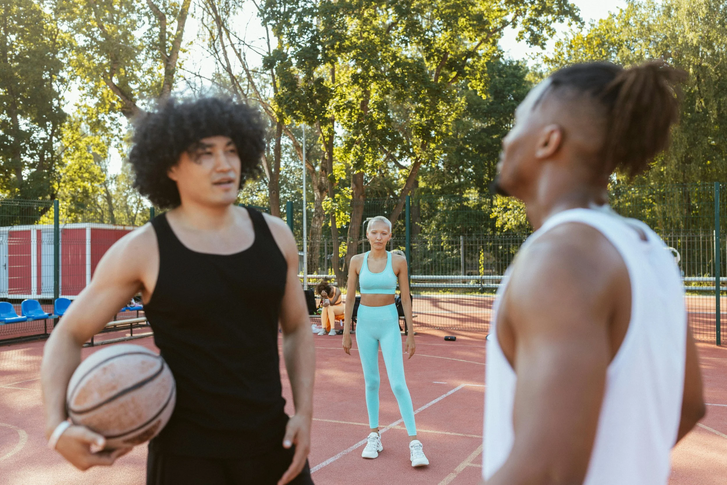
“In co-ed games, if you’re not as skilled, it’s because you’re ‘just a girl’, but if you’re good or better, then the tone sometimes shifts to something more aggressive and unfriendly. The unpredictability is exhausting.”
- Acrivi C., Interviewee & Tester
Solution
HerGame isn't just aiming to solve logistical problems — the goal is to create social permission and structural support for women to show up, participate, and build community through sport. Usability testing and general reception to the prototype have proven that the app is well on its way to achieving this goal.
My approach centered on:
Human-centered research to understand the emotional and logistical needs of users
Clear, friendly UX flows that reduce friction in joining or hosting games
Community-building features that promote trust, consistency, and safety
Design priorities included:
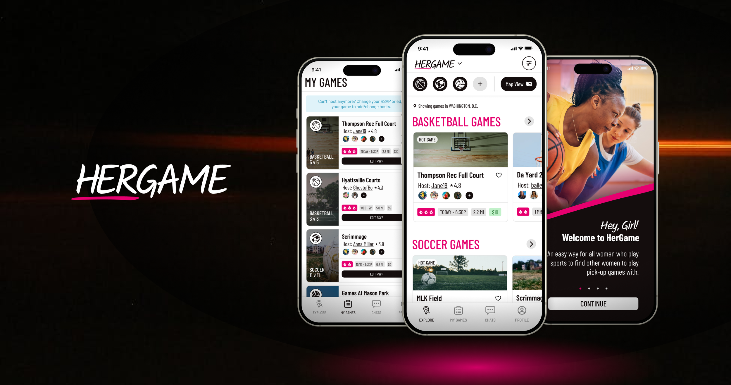
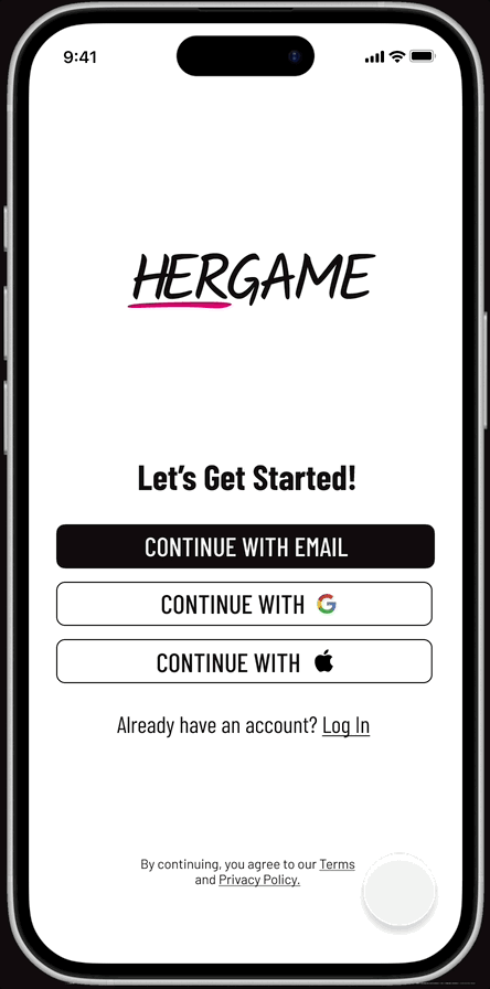
• Familiar and secure onboarding that helps users get started quickly.
• Minimal RSVP process to reduce no-shows and encourage accountability.
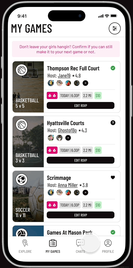
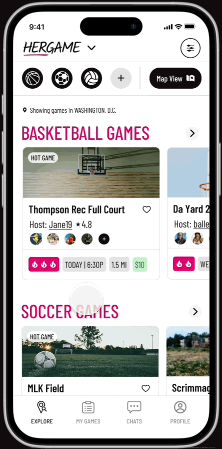
• Game cards with clear social cues and info tags like:
1. Who’s playing
2. Intensity level
3. Logistic details
• Quick and easy switching between Player Mode for finding games and Host Mode for finding venues to create games
Design Process
Research: Getting to Know Her
I began by surveying and interviewing a range of women, from former college athletes to beginners. I knew what kind of challenges and frustrations I was facing as a recreational female athlete, but it was important for me to hear the real-world frustrations of others. The goal was to understand both logistical and emotional blockers — what keeps women from playing, even when they want to.
Key Insights from secondary & primary user research
86% of respondents found it difficult to find and join games consistently.
Many women felt anxiety or discomfort in co-ed or male-dominated environments.
Users craved a platform that was casual, easy to navigate, and built for them.
Unclear skill levels, no-show players, and scheduling gaps reduced reliability.
These findings informed everything from core features to the app’s tone of voice.
Designing for Belonging
Rather than leading with features, I grounded each decision in three key intentions:
1. Connection – Build familiarity before players meet in person
2. Commitment – Make it easier to show up without pressure
3. Comfort – Reduce intimidation and signal safety and inclusion
This meant creating flows that encouraged trust without demanding too much from new users. Every screen — from onboarding to RSVP management — was designed to feel clear, calm, and supportive.
1. Building for connection meant carefully synthesising survey response data to narrow in on the user needs that stood out the most.
2. Getting players to commit to games meant thinking of ways to make it easy to find and assess gameplay
3. Comfort through design meant considering language, tone, and user privacy throughout the system.
Portions of user onboarding flow

Designing for Simplicity & Confidence
HerGame had to feel intuitive, even for users unfamiliar with fitness apps. I prioritized:
1. Streamlined flows for quick actions like joining, hosting, or updating RSVP
2. Gentle nudges to reduce no-shows without shame
3. A visual style that felt modern, energetic, and welcoming
1. Streamlined flows meant simple actions for quick updates and notifications between players and hosts
2. Gentle nudges meant small reminders on the benefits of being communicative and reliable, and making it easy to change your status


3. Visual style that felt modern, familiar, and welcoming meant considering color, contrast, and use of white space in ways that were proven to work through testing—not just a pretty vibe.
Visual design evolution of RSVP flow
Results & Learning
Results
User Feedback & Usability Testing
Two rounds of usability testing — held remotely and on-site — revealed strong enthusiasm for the concept and positive reactions to the experience.
“I wish something like this had existed when I was younger.”
- Participant, Former D1 Athlete
Testing session held at a cafe with Dani H.
What users showed me:
The app felt inviting, modern, and easy to trust
Casual players felt comfortable using it and could see themselves playing more often
Several said they felt like they were finally the intended user of a sports app
91% navigated key flows (onboarding, RSVP, host controls) without guidance
Usability testing also surfaced specific improvements, which led to:
More intuitive RSVP controls
Clearer game visibility and player details
Improved onboarding tips to build confidence from the start
What I Learned
Designing HerGame reinforced several important principles that I’ll carry forward into future work:
Design for someone, not everyone.
Staying focused on a clear primary user helped me make better, more intentional design decisions.
Validate early and often.
Assumptions I had about flow clarity and user priorities were challenged through testing — and the product got stronger every time I listened.
Small touches matter.
Microcopy, tone, spacing, and visual contrast all contributed to how confident and comfortable users felt navigating the app.
Next Steps
Building out messaging and invite flows to strengthen community connection
Refining the venue participation strategy for local partnerships and game hosting
MVP development and closed beta testing
The long-term vision is to support a wide range of play styles — whether someone wants to shoot around with a few friends or organize a full scrimmage. At its core, HerGame is about making it easier for more women to play, more often.