
Early Product Definition • Web App • Lead UX Design + Strategy
Laying a Strong Product Foundation Through UX Strategy

Project Overview
Introduction
Arete Science is a startup on a mission to make data more human — translating it into tools that support real progress for students, educators, and professionals.
Responsibilities:
Over a lively and collaborative four-week sprint, I led a small team of designers in UX research, ideation, and light prototyping — strategizing for Arete’s vision: providing clients and therapists with smarter ways to track and reflect on progress throughout their work together.
Details
Role: Lead UX Designer & Strategist
Project Type: Early Product Definition
Team: 1 UX Researcher, 2 UX Designers
Tools: Figma, FigJam, Miro, Google Docs
Timeline: Feb-Mar 2025
PROBLEM TO SOLVE
Therapeutic clients looking to improve their mental well-being struggle to assess and track their progress due to a lack of structured, user-friendly systems that provide meaningful, measurable insights and guidance.
Up to 15%
of clients drop out by session three, often due to unclear outcomes
Only 13%
of therapists use structured progress-tracking tools such as PHQ-9 or ORS consistently
A 20-30%
improvement in outcomes can occur with routine progress monitoring, especially for at-risk clients
Solution
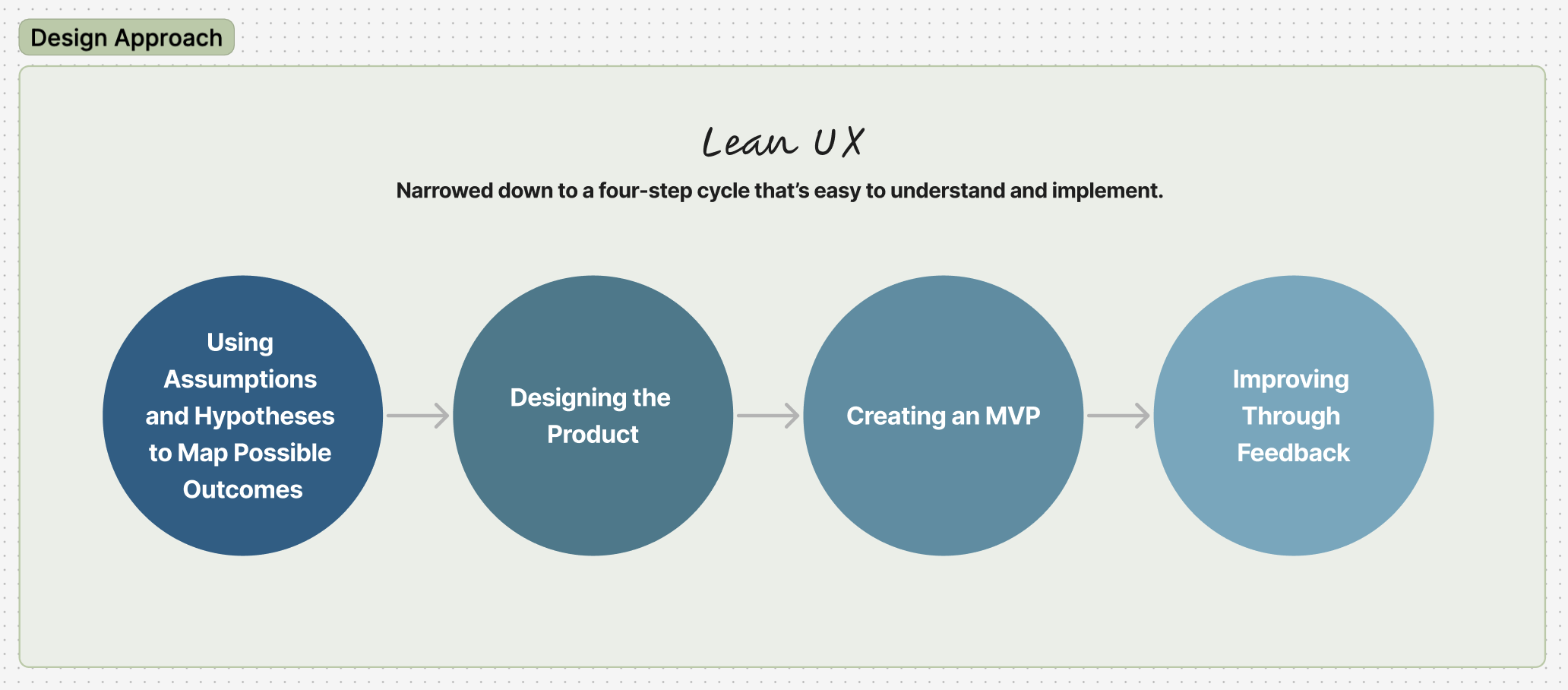
By combining thoughtful UX research and strategy with an iterative design approach, we laid the foundation for a web tool that could evolve based on user feedback and usability testing.
We delivered all ux artifacts (research, proto-personas, journey maps, flows, wireframes, light prototyping, and a sample style guide), which shaped the product foundation for Arete.
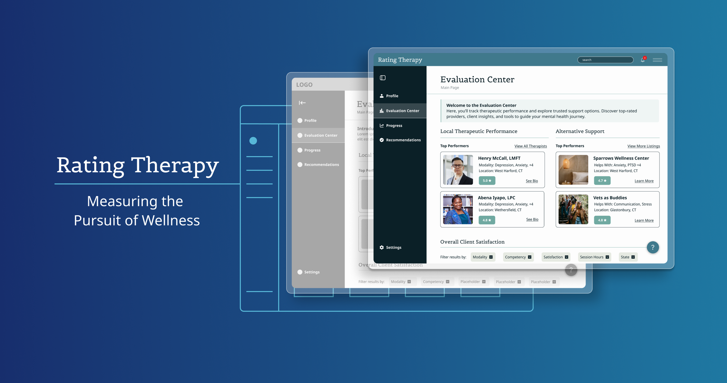
I specifically owned the evolution of the evaluation center and weekly check-in assessment screens, along with concept UI design and usability testing documents.
“This work is invaluable, thank you for doing this. You’ve really helped open my mind to what’s possible and what areas need more attention.”
- Daniel M. | CEO, Arete Science
1. Evaluation Center - A hub for at-a-glance data for more informed decision-making for client users.
2. Progress Tracking – A simple way for clients to record and reflect on their growth over time.
3. Personalized Therapist Recommendations - to help clients find therapists suited to their needs.
4. Experience Ratings – A structured yet flexible way for clients to provide objective feedback on their therapist.
Challenges I Encountered
New team, tight timeline
With just four weeks and a team of designers who had never worked together before, alignment was critical. I drew on my experience as a small business co-founder to quickly establish shared goals, build trust, and maintain open communication, especially with Arete’s CEO, who remained closely involved throughout.
Shifting scope mid-sprint
As our wireframes brought clarity to the CEO’s vision, the product scope evolved. Features were added, removed, or re-prioritized. This forced us to stay flexible, adjust timelines, and reframe our design efforts without losing momentum.
Design Process
Research & Strategy
I created a concise project scope outlining the timeline and deliverables. Taking a lean approach, we focused on building a light prototype that could be tested early for user feedback and iterative improvements.
While Arete had a vision for what they wanted to achieve and why, the how was elusive to us all. I felt that we needed to lay out all aspects of their suite of other products and consider what made sense for both the users and the needs of the business.
Using our research and our understanding of Arete as a company, we developed a proto-persona, user journey maps, and a service blueprint that helped to align the user experience with Arete’s broader product ecosystem.
My contributed service blueprint and customer journey map
Core Features & Experience Mapping
Based on research and feedback, we focused on four experience flows:
Evaluation Center – a central hub for session reflection and progress tools
Post-Session Rating Page – a gentle, structured way for clients to evaluate their experience
Recommendations Page – supports therapist comparison and booking consults
Progress Dashboard – surfaces helpful tools and data points over time
We mapped user flows for each, centering simplicity, reflection, and transparency. In a follow-up presentation with Arete, our low-fidelity wireframes played a key role in unlocking the next phase of product clarity.
Sample of flows created by Lindsey A. and Laxmi V.
Samples wireframe sketches created by me and Kazaria M.
Mid-Fidelity Wireframes
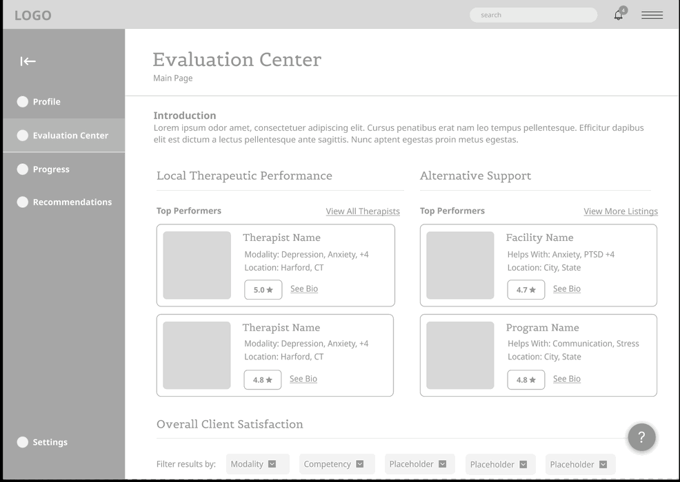
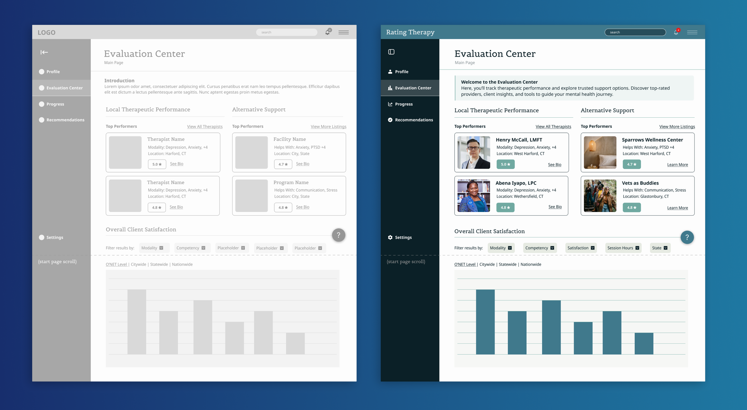
We went back to the good old pencil and paper and worked out some adjustments to our flows and planning before creating digital wireframes. While my teammates worked to refine their portions, I focused on creating the refined Evaluation Center and Weekly Check-in assessment to finalize our mid-fidelity, grey-scale wireframes and light prototypes. These weren’t polished UI screens; they were functional conversation tools designed to visualize concepts and gather feedback.
Stakeholder Feedback
Walking through the prototype with Arete’s CEO sparked major clarity. Several proposed features were deprioritized or restructured, and I gained stronger alignment on what should be validated first. Our visuals played a key role in shifting the product from abstract ideas to testable hypotheses.
My design evolution of the Evaluation Center
Results & Learning
Results
Delivered user flows and wireframes for 4 key features
Built a clickable prototype to clarify direction and drive feedback
Helped stakeholders reprioritize features and reframe product goals
Created a full usability testing plan to support validation
If we could continue the work with Arete Science, I would:
Facilitating immediate usability testing using the prepared plan and script
Using feedback to refine features, rebuild flows, and continue testing
Iterating toward a more validated and targeted MVP, ready for launch
What I Learned
You don’t need high-fidelity UI to make meaningful progress. In early-stage projects like this, the most important work often happens upstream in defining the problem, guiding conversations, and building just enough to make ideas tangible.
This project showed how UX strategy and facilitation can unlock clarity and momentum when the path forward is still taking shape.